Friday, 6 December 2013

Test shots

 
This is my example of a long shot. You can see the subject's feet and there is a lot of negative space around her. This is a bad example of framing because the subject doesn't fill the frame. There is too much space around her and the audience's attention will be waived from her to the areas surrounding her.
This is my example of a two shot. This shot is blurry, which wasn't my intention but this is also a shot of bad framing. A two shot is still too far away and both subjects are surrounded by too much negative space.
 
 This is my example of  a group shot. This group shot isn't a good example because the group would have to be postitioned so that the orientation of the image was portrait however, this is landscape. If I were to do a group shot for the front cover of my magazine I'd postition it so that my subject's were close enough together, or above each other so the image could be taken portrait so it would fill the full cover/page.

This is my example of a medium close up. This image could have been taken portrait, which I should have done. I will possibly use a medium close up for my front cover because I could then get my subject's clothes in the image and allow my audience to understand the genre of my magazine though the clothes my subject is wearing.

This is my example of a close up. This is the perrfect example of framing for a magazine. There is no space between the top of my subject's head and the top of the image, there isn't much negative space, my subject fills the frame and it is photographed on a plain background (this makes it easier to over lay text).

This is my example of a posed shot. My final shot will be a posed shot, but will be closer and more tightly framed than this one. It will more likely be a posed medium close up or close up. This image has too much space around my subject. In order to fix this I would either crop the image so it is of the frame size I want, or take a posed image as a close up.

This is my example of a bad framed shot. The shot is skewed and blurred, everything a magazine doesn't want out of an image. To make sure my shots aren't like this I will use a tripod whilst taking my image so I can get the right framing, it will make sure I can't skew the image and it will help me against blurring my images.

Friday, 29 November 2013

Mood board of general ideas

In this mood board I have included examples of pop magazines, examples of pop costumes, suggested hair styles for my artist and some pop artists who have up coming tours which could be used as competitions.

Focus Group

Photography

My Demographic Choices

Definition of Demographics

Definition of Demographics by ToniWilson13 on GoAnimate

Social Class Table


Music Magazine LIIAR Analysis

Language- 
There is a medium close up image of the popular pop artist, Cheryl Cole looking into the audience eyes, having direct address and connecting with the audience. The masthead on the magazine is based at the top of the page, usually on a magazine the masthead would be covered by the top of the subjects head, on this magazine the masthead is based above the image dominating the celebrity. The title is based on the top left corner, there is a large red box with a large 'Q' in white based in the centre, this is eye catching and being on the left hand side means that it will be noticed when stacked on the shelfs in shops. Under the title are headlines for the stories in the magazine, these are placed around the artists face in order not to cover t. This keeps the readers attention on the stories without being distracted by the image. It also draws the reader's eye around the cover, instead of their attention being just on the middle of the front cover. This allows them to explore and get a better feel for the magazine. The main colour scheme here is red, black and white. This gives the magazine a fee of simplicity but also looks classy at the same time. The red is tied into the main image also by the artist's lips being red. Red connotates lust and love, which is also the impression being given out by the way the artist is posing. This entices both male and female readers; females who aspire to be like Cheryl Cole and males who find her attractive.
Ideology- 
The brand 'Q magazine' has developed a worldwide reputation as a trusted high quality voice of music amongst fans, musicians and the music industry. The reputation is seen through radio, TV, online and through the amount of fans it has. In its early years, the magazine was sub-titled "The modern guide to music and more" as it was able to set itself apart from other music magazines with its higher standards of photography and printing.
Institution- The Bauer Media Group (Bauer Verlagsgruppe) is a large German publishing company based in Hamburg, which operates in 15 countries worldwide. Since the company was founded in 1875, it has been privately-owned and under management by the Bauer family. Q started out as a music magazine published monthly in the United Kingdom. Originally it was to be called Cue (named after the act of cueing a record to play), but the name was changed so that it wouldn't be mistaken for a snooker magazine 
Audience- Q's audience is made up of passionate and open minded music fans who are driven to always discover new music.  The audience are the encouraged to use this lust for discovery to influence their friends. The audience is split 75% male to 25% female (with 68% ABC1).
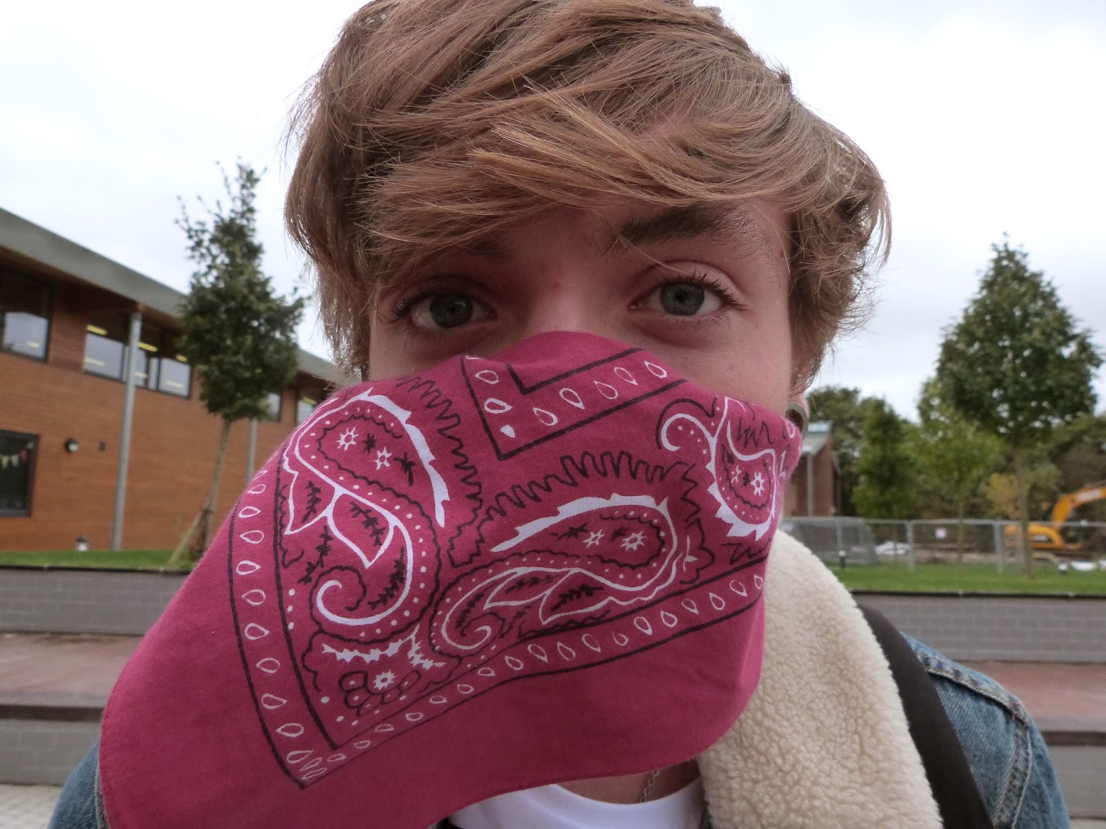
Representation-
On the cover of the magazine there is a large medium close up image of the well known pop artist Cheryl Cole. She is known for her pop and chart music but is seen on this image as a rocker with dark make up and red lips, connotating lust and passion. In her hand she has a ring on that looks like a dagger, she is touching the dagger with her tongue which shows she is ruthless and rebellious. This indicates the the magazine is aimed at a youthful audience. However this magazine also appeals to an older audience by offering a story about John Lennon - a legendary musician that a more younger audience may not be able to associate with. This is a way that Q magazine appeals to both audiences. 


Language - 
 There is a large masthead at the top of the page which is against a plain red background, this creates the text to stand out and help the audience identify what the page is about. The page features a colour theme, consisting of: red, black and white. This is a continuous theme throughout the magazine, therefore creating a professional pleasing style. The contents page is conventional as it features articles that will be featured in the magazine, as well as the page numbers to indicate the different articles featured. However, this contents page also breaks conventions; as the page features many images which dominate some of he page (however the main artist - Cheryl Cole - still dominates the majority of the page). These extra images come with text indication on which artists will feature on what page. However because the writing is quite small compared to the size of the images, it connotes that because the genre or the magazine is Pop/Rock, the audience should know who the artists are, because they are currently popular and match the magazine genre. In this issue, the main feature artist is Cheryl Cole and on this contents page, this is identified by the image of her being predominately larger and dominating the page, catching the readers attention.
Representation - 
The contents page features  lot of text but this is balaced out by images, which I think represents the audience well, as they will be able to identify who the artists are. It will suit the target audience of teenagers and young adults, because they want to read text but would want some images to look at also. A continuous colour theme has been used, consisting of: red, white and black. This is effective because it allows the dark text to stand out against the white background.This matches the continuous house style throughout the magazine.


Language - 
The double page spread features an A4 image of the main feature artist Cheryl Cole, who's image dominates a whole page. This stands out, letting the audience identify who the magazine is about. It is eye catching and effective because if the reader was flicking through the magazine, he image would attract their attention and they would know immediately who the magazine is about. It is also what the reader see's first when flicking through the magazine, with the main image being on the left hand side. The colour scheme: red, black and white from the contents page and front cover, is continued on the double page spread giving a sense of continuity and not confusing the reader. This double page spread also relates to usual conventions, such as featuring pull quotes from the article. This connotes a sense of rebellion, which represents the rebellious side to the magazine. As well, the only masthead featured on the spread just says, "Cheryl COLE", this is effective because the audience will be intrigued and want to know what the article is about because no information is being given out. 
Representation - 
The double page spread is about the artist Cherly Cole, therefore the magazine is promoting her and her new album, which is rock themed, making her relate to the genre of the magazine. The image of her is or high contrast, which matches the colour theme of the magazine, which contrasts highly also. 


Thursday, 21 November 2013

Google Mock ups

 
For this magazine mock up I started with a picture of Rihanna. I cropped in down so it was typical magazine cover size and added my masthead, PLAY. My masthead swaps the 'A' in 'PLAY' for a typical play button. I decided to do this because it makes the magazine stand out more as a music magazine because if someone passes they'd easily know what genre magazine it was. It is also quirky and fun to appeal to my teenage audience. I chose fun and bright colours which is conventional of a pop music magazine and a bold font so it stood out against a background. I added a main story and feature stories around the outside of the magazine to make it look more realistic and a barcode which is also conventional for a magazine.  

This magazine mock up features mainstream pop artist Beyonce. She is well known in the music industry and liked by males and females. To reflect this I chose the bright colours of green, light pink and red. Red being a mutual colour, green which is usually stereotyped to appeal to makes and pink for females. I also found it hard not being able to put white or black as a colour choice of the font, but both wouldn't stand out against the background because of the white background and the black leather jacket she is wearing. I managed to put some in to neutralize the cover slightly, at the bottom as a footer to show other feature stories in the magazine. I used rhetorical questions in the main feature story to entice and interest readers and draw them in to read the magazine.
This magazine cover feautres Katy Perry, a predominant female artist in the UK Top 40 right now. The main feature story is written across the centre of the page in a bright pink so that it stands out to the reader and catches their attention. I only chose two colours for this magazine cover - black and pink - because I think it adds to the simplicity of it. Adding another bright colour would just contrast and make the magazine look childish and not appealing. 

Friday, 8 November 2013

Colour Scheme Ideas - Music Magazine


Costume Ideas - Music Magazine


Font Ideas - Music Magazine


Genre Research - Music Magazine

Genre Research

I am basing my magazine on the genre of pop.  like the pop genre because the music appeals to me, as do the styles of the artists. It's very bright and fun making it interesting to look at and something that would easily catch the eye of a passer by.

Pop music, a term that originally comes from from a shortened version of the word  "popular", is a genre of music which started in its up to date form in the 1950s, originating from rock and roll. The terms popular music and pop music are often used similarly, even though the term ''pop music'' is merely a description of music which is popular at that time, which could include any genre of music. As a genre, pop music is very electric, often including other elements from other styles of music including urban, dance, rock, and country; however there are elements of pop that define the genre. Such as short-to-medium length songs, usually between 2 and 4 minutes, written in a verse-chorus structure, as well as a repeated choruses and catchy lines to hook people into the music.

Some artists included in the pop music genre include: Miley Cyrus, Katy Perry, Ke$ha, Beyonce, Rihanna, One Direction, Union J, The Vamps, Olly Murs and many more. In the UK Top 40 now there are artists such as: Eminem, Lorde, One Direction, One Republic, Tinie Tempah, Katy Perry, The Wanted, James Arthur, Miley Cyrus and Jason Derulo.
Some magazines in this genre include:


Both these magazines have similar qualities. They both have bright and bold colours, they're both very crowded with information and celebrities and they both have the word ''pop'' in the masthead.

Some pop music videos incluce:
http://www.youtube.com/watch?v=nlcIKh6sBtc&list=PL55713C70BA91BD6E

http://www.youtube.com/watch?v=LrUvu1mlWco&list=PL55713C70BA91BD6E

http://www.youtube.com/watch?v=RbtPXFlZlHg

The costume of my model in my magazine I want to be quite similar to that of these artists. For example, a bold print dress or a sparkly top with a black skirt. Something that will stand out a lot.

Friday, 18 October 2013

Reader Profile of a Music Magazine


This is a reader profile from NME Music Magazine.  It states all the relevant in depth information on the audience of the magazine. The first we can see is the stats of the gender and age of the audience. The dominant readers tends to be male (68%) compared to women (32%). The average age tends to be around 24 and NME have took this into consideration by putting male oriented things into their magazine such as alcoholic drinks that tend to be associated with males, male brands such as Top Man, boy bands and speakers. This shows that NME think a lot about how to make their magazine appealing to this specific audience. The magazine has also putt Top Shop (a brand specified to females) onto their reader profile because even though the majority of readers they have are male, there are some female readers. This shows that they think about the smallest details as well so that the magazine appeals to females also.  The reader profile also tells me that there are two reader groups – students and people that are employed for the first time. It is essential that NME research the interests of students and socially active people in their first job so that they know they are meeting the correct expectations of their audience. The people that read the magazine are pretty high class (75% ABC1) which means the magazine has to put something in the magazine that’s appealing to their tastes, such as high class drinks like Jack Daniels and brands such as Top Man. It would be useless putting a brand such as Primark or Pound Stretcher on there because; because of the reader’s high class it wouldn’t appeal to them.  It shows that most of their readers are interested in music and style which means they have to include things of this type to keep their readers engaged.  The bottom images show that the magazine also includes things that people of a lower class can afford. This shows that they want to make their magazine appeal to those of a lower class to keep their readers more wide spread and to make people that aren’t as higher class, like some students, feel included and not like an outcast.

Thursday, 17 October 2013

Music Magazine Brief


• To design a front cover, contents and double page spread of a new music magazine. All images and text used must be original, a minimum of four images must be used.

Magazine cover Evaluation - Preliminary Task


Preliminary task College Magazine front cover

Evaluation questions
My media product is a magazine front cover, which usually have conventions such as a mast head, plug, header, footer, barcode, feature stories, and a main image. I have took this into consideration when creating my cover such as my main image had to be near enough centre so that I could fit feature stories around the sides of the cover. The barcode of real magazine covers is usually on the bottom right hand corner, which is where mines placed. I did this to mimic the professional look and make my cover look real. I did the same with the footer and mast head.

With my magazine cover I haven't really isolated a social group in my media product. The main image is of a girl holding a folder, and my feature stories can be related to by both male and females, or all social groups. I wanted to leave it open to all social groups because there seems to always be some sort of divide between them in colleges and I think the one way to bring them all together would be a college magazine, so that one or a few didn't feel completely left out. As a college we should be including everyone and not focusing the magazine on a certain group.
My audience would be college students aged 16 to 18.

I attracted my audience by putting the colours of text on my magazine cover the same as the college. This way they'll feel like it's familiar and not too much like its a new thing. I also put a student on the cover to make them feel equal to them, if I put a super model on the cover they'd feel beneath them. I have addressed them by putting the feature stories ones that they can relate to and find helpful and informative. By putting about study periods and fresher's party I am able to connect with them because they know and have heard about them things.

During this task I have learnt how to use photoshop properly. I have learnt how to use layers to change things and how to change text and font colours. I have also used how to constuct an appropriate front cover image by using composition and chosing the right background.
Looking back on my perfume task, now I think I have learnt how to construct a better looking product. My magazine cover looks professional and sophisticated where as my perfume advert looks like a student has done it. I now understand properly how to use conventions to construct a professional looking product.
If I was to do this task again I would try to make sure I had all the conventions in there instead of missing out a header. I think putting a header on my cover would of made it look even more professional however I couldn't of moved my mast head down any more to fit one it. To do this I would of had to go futher back when taking the image to make more room between my subject's head and the top of the image, this way I could of fit both in.